The Psychology of Color for Effective Marketing
By Gary L. Bezella
Guest Columnist
Color changes people. Colors affect our mood, personality, and buying choices. The right color can boost your advertising effectiveness, but the wrong colors can hamper your marketing.
It’s important to understand the psychology of color to ensure heavy traffic from your advertising. But never let the color of your advertising overpower its overall message.
Here are common colors used in marketing and why you should – or shouldn’t – use them.
For signage, always use pure/bold colors. Advertisements are rarely “stared” at — viewers are often passing when they see them, so it’s important that they stand out and can be read and processed quickly. When lettering has tints it looks softer, more feminine, and “nicer,” but takes so much more work to read.
Black

The color black symbolizes authority and power. Black can be a very effective background color with light or bright text and images.
However, a black background with dark text can be too difficult to read so don’t put red or blue text on black. Also, it is harder to read black-backgrounds in the evening, no matter what color text is.
White

White can be a very comforting color because it symbolizes cleanliness and purity. White is an effective background color for a website or advertisement with dark or bold text.
However, a white background with light or bright text (ex. yellow) can be too difficult to read. Almost any color text will work on a white background. It is the most legible. However, as a text color, it is only legible on dark backgrounds. But when it is used as a text color, it is clear-cut and simple.
Red
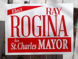
Red is associated with passion and high energy. Red can be a powerful color to engage the audience and draw their eye to your desired marketing piece. Red is an effective background with light or white text.
It’s commonly used to drive impulse purchases. That’s why it’s almost always used to sell discounted and clearance items. In addition, red, when combined with blue, is commonly used for political advertisement.
Blue

Blue is consumers’ favorite color because it’s calm and symbolizes authority and dignity. Blue is also known as a business or professional color. Blue text with a white background is an effective design; however, blue text with a black background might be too difficult to read.
Blue is commonly associated with conservative companies. Most men prefer blue. Also, when a blue texted word is next to a red texted word, the red one will be read first.
Green

Green is a soothing color because it symbolizes nature and freshness. Green also communicates health or eco-friendly products/service to customers.
Because it is such a soothing color, green will most likely not push viewers to do what the marketing is telling them to do.
Brown

Brown symbolizes dependability and solidarity. It is also known as a safe and comforting color. Brown is often associated with outdoor activities or construction.
Brown could be a good background color, but for reasons similar to black, brown might be difficult to read in the evening.
Yellow and Orange

Yellow and orange symbolize alertness and optimism. Yellow can draw in impulsive buyers and orange is often associated with caution.
Too much yellow or orange can create a sense of anxiety. If used as a text color, it should only be on a black background.
Pink and Purple

Pink and purple are similar colors because they both have a feminine and creative quality. Purple symbolizes royalty and wisdom and tends to be used for beauty products. Pink symbolizes femininity and calmness and is used for products catered for women.
Pink and purple are typically preferred by women.
Pinterest Infographics
You’ll find great infographics on the psychology of color on Blogging Bistro’s Pinterest board.
 Gary L. Bezella is the Operations Manager for PromoteSigns.com. He’s been in the advertising and sign industry for over 28 years. He is the lead graphic designer, creating sign designs for both the promotional as well as the political markets. He is committed to keeping himself current on the industry trends in the printing and graphic markets.
It seems the ads presented above aren’t just bad for color psychology but even bad for eye sights. Thanks for sharing this Laura. This would perfectly create awareness for marketers that colors psychology has impact on our marketing efforts. 🙂
It seems the ads presented above aren’t just bad for color psychology but even bad for eye sights. Thanks for sharing this Laura. This would perfectly create awareness for marketers that colors psychology has impact on our marketing efforts. 🙂
[…] Be sure to check out yesterday’s guest column by Steve Bezella on The Psychology of Color for Marketing. […]